How a schematic map gets made
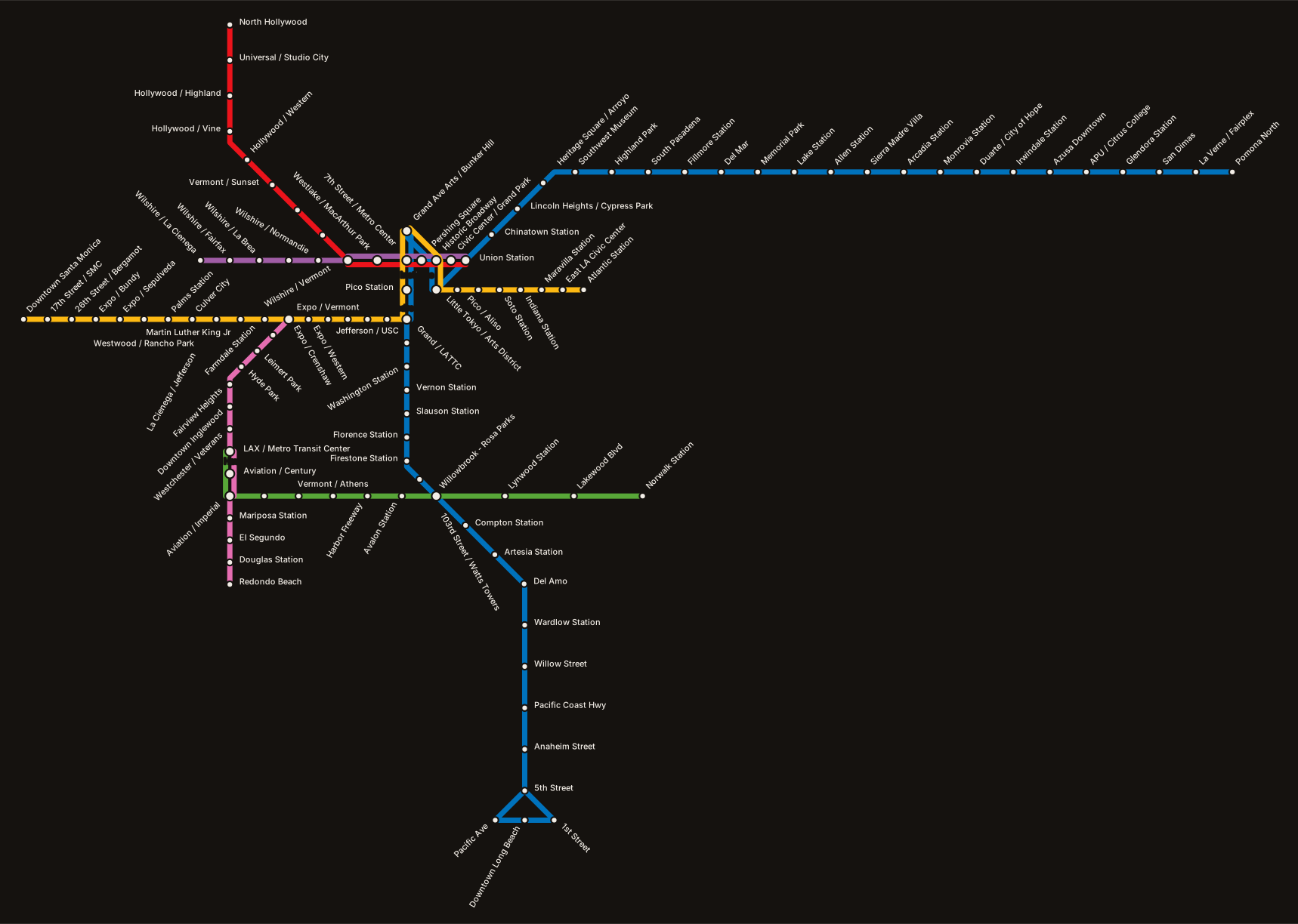
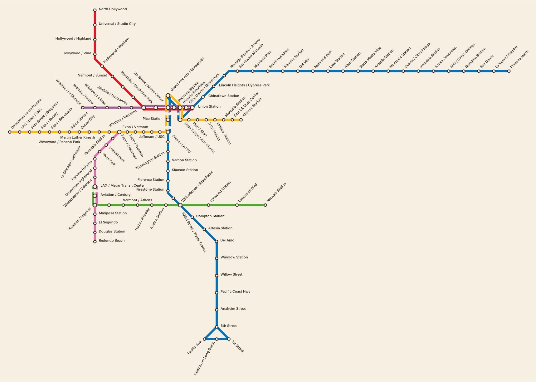
Every map in Legible Cities comes from a single input: a zip file the transit agency publishes for anyone to download.
There is no drawing step. Nobody positioned a station or chose where a line should bend. Twenty-two rail networks — Los Angeles, New York, Chicago, Boston, Mexico City and seventeen more — went through the same code and came out as diagrams. This is how that works, and, more importantly, whose work makes it possible.
The input: what a transit agency actually publishes
The format is GTFS, the General Transit Feed Specification. It began at Portland's TriMet in the mid-2000s as a way to get bus schedules into Google Maps, and it became the thing the whole industry agreed on. When your phone tells you the next train is in four minutes, a GTFS feed is somewhere underneath.
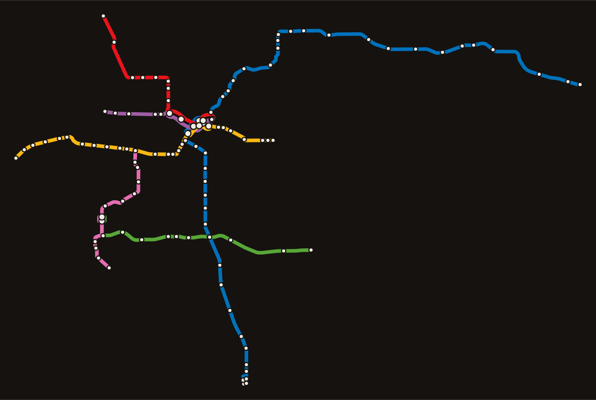
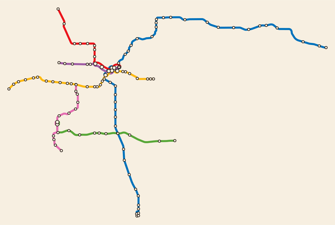
A feed is a zip of plain CSV tables. routes.txt lists the lines. stops.txt lists every platform with its coordinates. trips.txt lists each individual run of a train. stop_times.txt — usually the largest file by far — records when each of those trips reaches each of its stops. shapes.txt traces the physical path the vehicle takes.
That is a complete description of a transit system. It is not remotely a map. Nothing in it says which lines should run parallel, how a station with four platforms should be drawn as one dot, or what angle a curve should be simplified to. Getting from one to the other takes six stages, and each one throws something away on purpose.
The six stages
Read the feed into a graph. The first step turns tables into a network: stations become nodes, track becomes edges, and each edge knows which routes run over it. It is still geographic — every station sits at its real coordinates — but it is now a structure you can reason about rather than a spreadsheet.
Merge what overlaps. Real feeds describe a station with several platforms as several stops. A rider sees one station. This stage folds those together, and merges track that several routes share into one edge carrying several lines. Los Angeles has 114 stops in its rail feed and 110 stations on the finished map; the four that vanish are second platforms at the big downtown interchanges.
Decide the order of the lines. Where routes run together, something has to choose which one is drawn on the left. Get it wrong and parallel lines cross each other pointlessly at every junction, which is visually noisy and quietly misleading. This is a genuine optimisation problem, and it is solved rather than guessed.
Schematise. This is the Beck step: the whole network is snapped onto a grid where every segment runs horizontally, vertically, or at forty-five degrees. Geographic truth is traded for legibility. On the finished maps, over 99% of the drawn length sits on one of those angles.
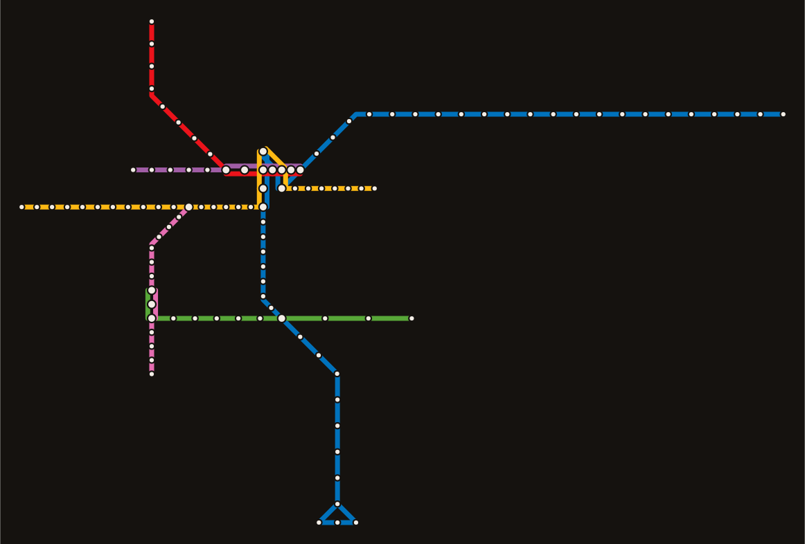
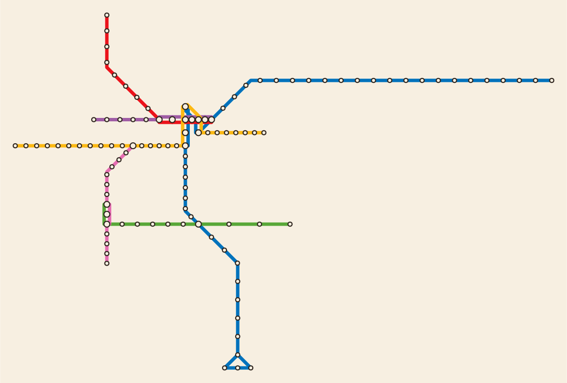
Draw it. Parallel lines are offset onto their own tracks, stations are marked, and station names are placed. Naming is harder than it sounds: a straight run of twenty stations cannot take twenty horizontal labels without them overwriting each other, so names are rotated off the line and tested for collisions against everything already on the page.
Run the timetable. The last stage walks every trip in the schedule across the drawn network and works out where each train is at each moment, so a whole service day can be played back.
Whose work this actually is
The first four stages — the ones that contain the real computer science — are LOOM, from Hannah Bast, Patrick Brosi and Sabine Storandt at the University of Freiburg. Their published work on generating transit maps at scale is the foundation this project stands on. LOOM takes a geographic network and produces a schematic one, solving both the line-ordering and the octilinear layout. It is released under the GPL.
I want to be plain about this: without LOOM there is no project. What I added is the drawing and the animation, and I only wrote my own renderer because the animation needed geometry it could address by name — one path per line per segment, so a train can be placed along it by distance. LOOM ships a perfectly good renderer of its own, and the project draws both side by side as a check that my version has not misread anything.
I found LOOM through mooey, Thomas van Dijk's interactive editor for schematic map design, which was where this whole thing started. Its central idea — that a designer fixing the direction of a few edges by hand, with the layout recomputed instantly, beats full automation — is still the most interesting unexplored direction here.
The same Freiburg group also publishes pfaedle, which generates accurate track geometry from OpenStreetMap for feeds that lack it. None of these twenty-two needed it, but it is the answer when a feed has no shapes.
And the Mobility Database catalogues open transit feeds worldwide. It is how I found the current download URL for each agency instead of guessing, and it is the reason Mexico City is in the project at all — more on that below.
Beyond the software: Harry Beck, whose 1933 Underground diagram is the original argument that a transit map should be judged by how well it serves a journey. Lance Wyman, Arturo Quiñones and Francisco Gallardo, whose Mexico City Metro icon system remains the standard these maps fall short of. And twenty-two transit agencies who publish their schedule data openly and for free, which is the quiet civic act the entire project depends on.
What real transit data is like
The pipeline was straightforward. The data was not. Almost every difficult hour went into the gap between what the specification describes and what agencies actually ship.
A GTFS zip is only mostly GTFS. San Francisco includes its data license agreement inside the file, as a .txt sitting alongside the real tables. Reading every text file as a spreadsheet works fine until you hit a paragraph of legal prose.
Some feeds do not name their lines. LA Metro leaves the short-name field blank on all six rail routes, so a naive read produces six lines all called nothing. The full names are there — "Metro A Line" — so the fix is to derive one from the other before anything downstream sees the feed.
Headers are not always clean. Metra's column names arrive with leading spaces, so every join silently fails until you strip them.
A feed can carry several operators, and the mode does not separate them. Mexico City's feed includes eight agencies. Ferrocarriles Suburbanos has a line called "1" classified as heavy rail — exactly like Metro Línea 1. Without filtering by operator, the two merge into a single line that does not exist.
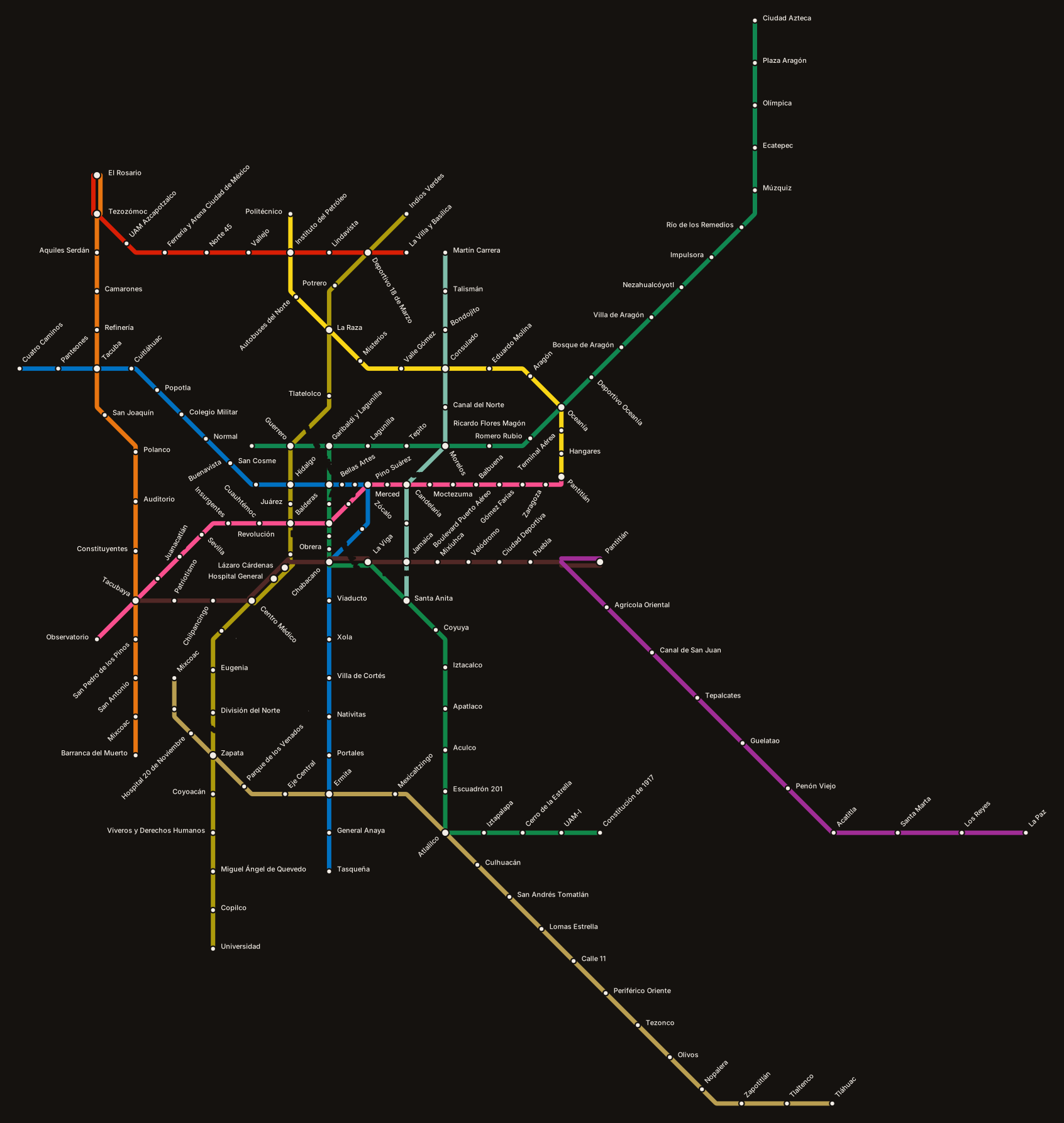
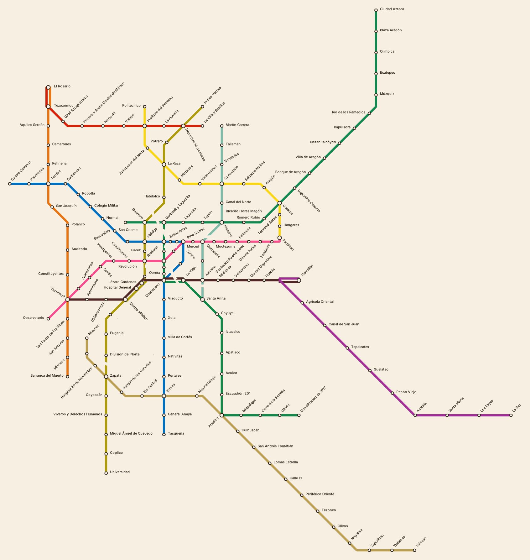
Not every agency publishes a timetable. Mexico City publishes 72 template trips whose stop times all begin at 00:00:00, plus a table saying "run this one every two to four minutes between these hours." Left as-is, every train in the city departs at midnight and nothing moves. Expanding those intervals into real runs produces 8,360 trips for a single Monday.
Feeds expire. Mexico City's own open-data server no longer answers, its mirror refuses the download, and the archived copy that does work covers a service period that ended in December 2025. The map is real, and it is a snapshot. The project says so on the page rather than letting the date imply otherwise.
I mention these not as complaints but because they are the actual work. Anyone who has done data work in a professional setting recognises the shape of it: the interesting problem is quick, and the fidelity is slow.
What it cannot do
Two limitations are worth naming, because a visualization that hides them is asking for more trust than it has earned.
The first is that some trains are drawn on the wrong track. Where the schematiser does not attribute a segment to the line using it, a train follows the right corridor on a neighbouring line's track. In Los Angeles this never happens. In New York it affects roughly a quarter of the hops. Every network in the atlas states its own number.
The second is the one that matters more. The Mexico City Metro's station icons — the grasshopper at Chapultepec, the aqueduct at Chapultepec's neighbours, a whole visual language that lets someone use the system without reading it — are not in any schedule file, and no amount of processing one would produce them. That is not a gap in the data format. It is a reminder that the part of information design which carries cultural meaning is done by people, deliberately, and cannot be derived from an operational dataset.
The stack, briefly
The pipeline is Python. LOOM runs in Docker, built from source for whatever architecture the machine happens to be. The maps are SVG, drawn directly rather than through a charting library, because the animation needs stable element identity. The animation itself is a few hundred lines of plain JavaScript with no framework — each trip carries the times and stop positions, and the browser interpolates between them.
Adding a new city takes one entry in a registry: a name, a feed URL, and which modes to include. Everything after that is the same code. Twenty-two networks is not twenty-two projects; it is one project run twenty-two times, which was the point of building it that way.
The maps, the running timetables, and the full credits are at richc117.github.io/legible-cities. The argument behind the project — why any of this matters for how a city is understood — is in Making complex cities legible.